
Introduction to Data Visualization in Analytics Ezapp
Data visualization is the graphical representation of information and data. By using visual elements like charts and graphs data visualization tools provide an accessible way to see and understand trends, outliers, and patterns in data. In the world of Big Data, data visualization tools and technologies are essential to analyze massive amounts of information and make data-driven decisions. With the technological revolution, data went from expensive, difficult to find and collect to abundant, cheap, but incomprehensible. It is arduous to store, understand and analyze increasingly larger volumes of data with traditional software’s. However, as individuals or an organization, all of this data is only as good as what we can make out of it. This is where Big data comes into play. Big data is used for predictive analytics, analyzing user behavior or other data analytics processes to bring value to data. Yet, the raw details about this can remain uncertain due to lack of knowledge. Data Visualization helps tackle this issue.
What is Analytics Ezapp ?
Analytics Ezapp is a data visualization tool that permits you to rapidly interface your information, set it up, and model it as you like. It enables you to change all your information into live intelligent visuals, make redid ongoing business see dashboards, in this manner extricating business knowledge for upgraded dynamic. You can visualize data and offer experiences. This instrument permits you to insert your custom visualizations into your application or site, interface with many information sources like dominate, google analytics for constant information and so forth It amalgamates everything advantageously with your current expert climate permitting you to get examination and announcing abilities. You can distribute these reports, accordingly permitting every one of the clients to profit the most recent data.
The advantages and benefits of good data visualization
Our eyes are drawn to colors and patterns. We can quickly identify red from blue, square from circle. Our culture is visual, including everything from art and advertisements to TV and movies. Data visualization is another form of visual art that grabs our interest and keeps our eyes on the message. When we see a chart, we quickly see trends and outliers. If we can see something, we internalize it quickly. It’s storytelling with a purpose. If you’ve ever stared at a massive spreadsheet of data and couldn’t see a trend, you know how much more effective a visualization can be.
The different types of visualizations
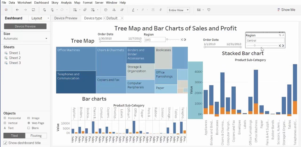
Data visualization, your first thought probably immediately goes to simple bar graphs or pie charts. While these may be an integral part of visualizing data and a common baseline for many data graphics, the right visualization must be paired with the right set of information. Simple graph are only the tip of the Iceberg. There’s a whole selection of visualization methods to present data in effective and interesting ways.
Common general types of data visualization:
- Charts
- Tables
- Graphs
- Maps
- Infographics
- Dashboards
More specific examples of methods to visualize data:
- Area Chart
- Bar Chart
- Box-and-whisker Plots
- Bubble Cloud
- Bullet Graph
- Cartogram
- Circle View
- Dot Distribution Map
- Gantt Chart
- Heat Map
- Highlight Table
- Histogram
- Matrix
- Network
- Polar Area
- Radial Tree
- Scatter Plot (2D or 3D)
- Streamgraph
- Text Tables
Visualizations:
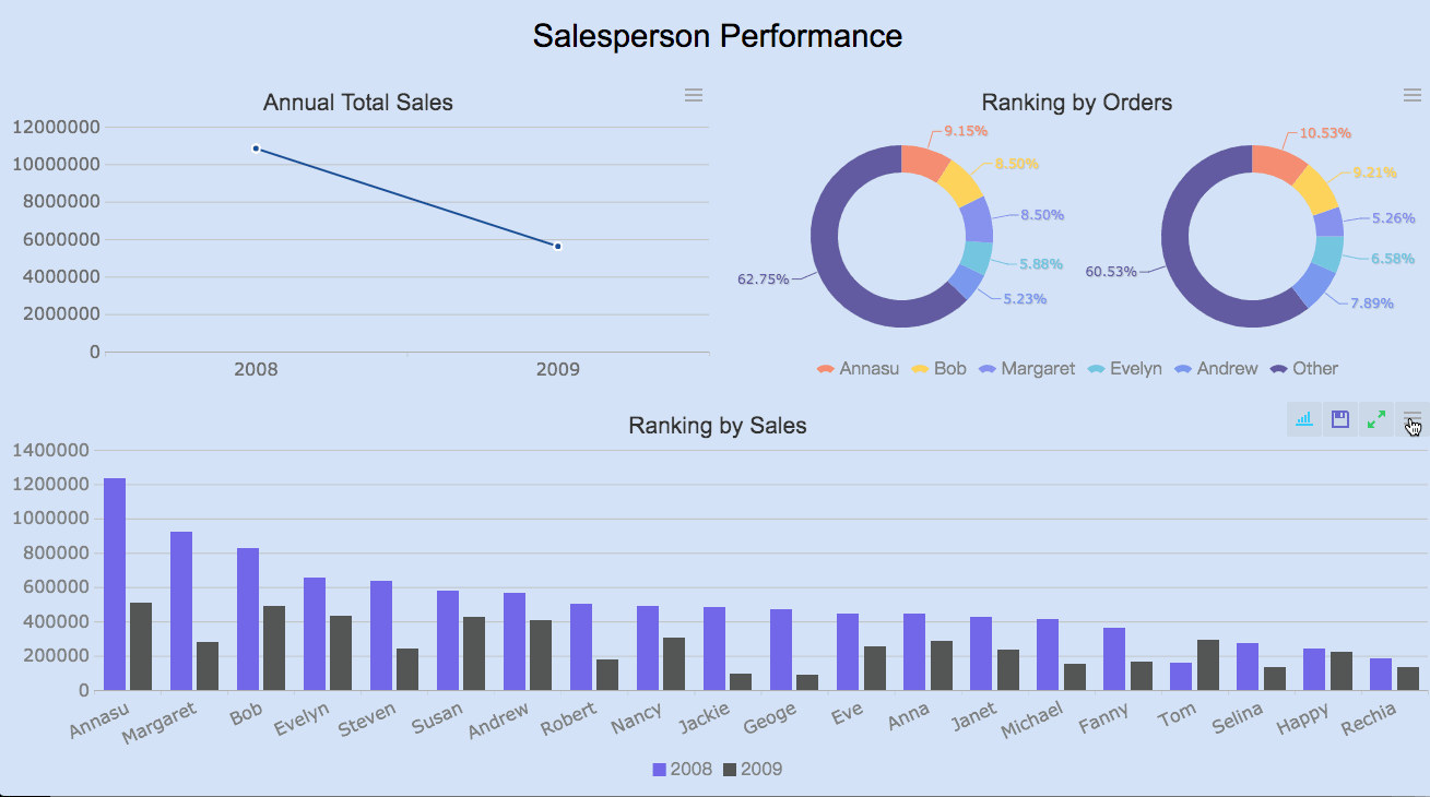
Bar Charts: Now that our data has loaded we can view it in the Fields pane to the right of our screen. We can select our desired visualization from the visualization pane and go back to the fields pane to select the data that we want to analyze. Let’s start by analyzing the products in our inventory and its sales. Select the Average Inventory On Hand ($), Sales ($), and the Category fields.
This bar chart compares the sum of the Average Inventory and the sum of the Sales for every Category. However, a logical way of studying this would be to compare the Average value of our Inventory and the Average Sales for every category. We can do this by changing it’s values from Sum to Average in the Visualization pane.
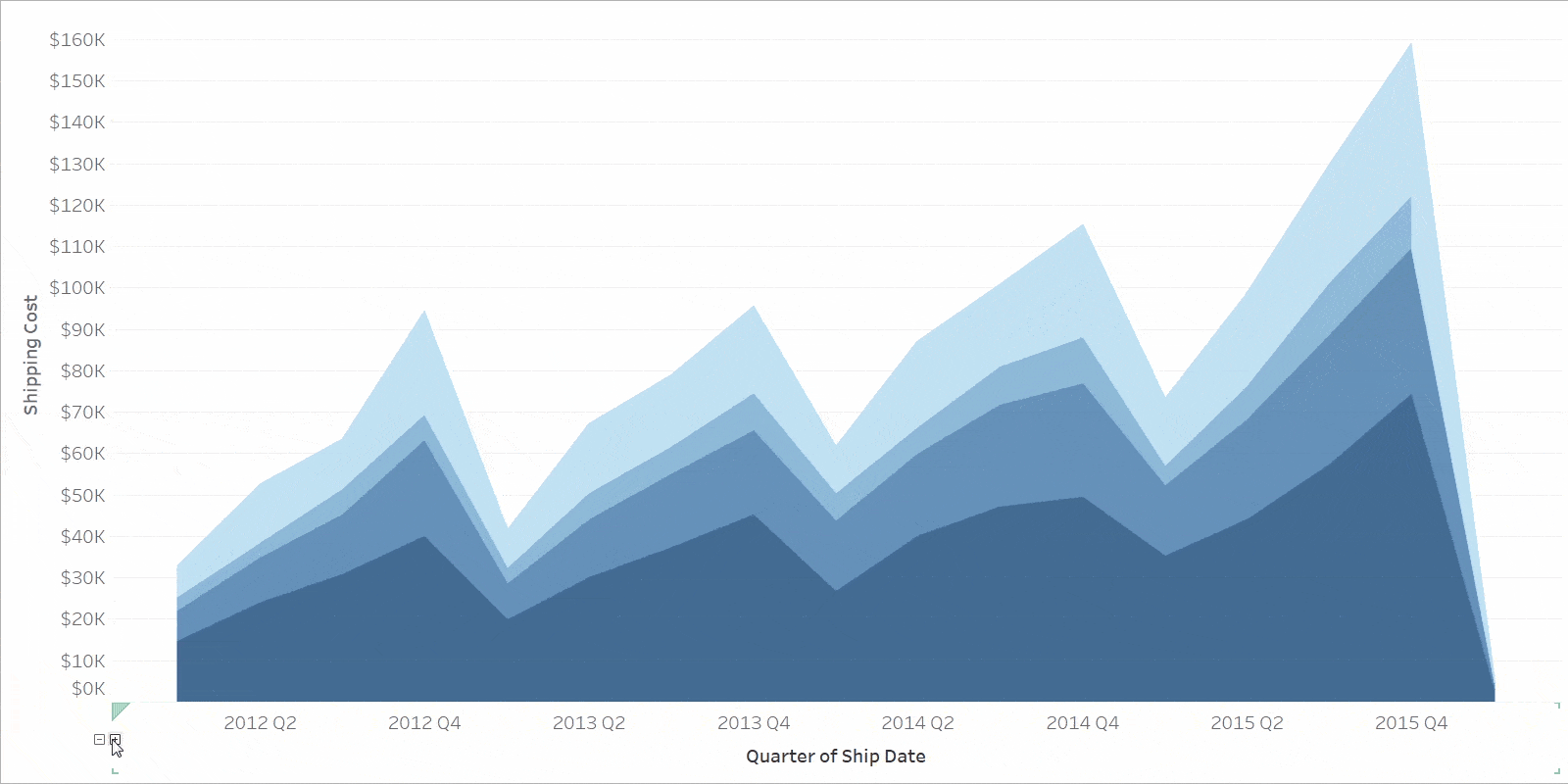
Line Charts: Let’s visualize our data using a line chart. Select the line chart from the visualization pane and select the Sales field from Geo Data in the Fields pane. Drag and drop the Week ID into the Axis section of the visualization pane as shown in the video below. This shows us the sales made with respect to the week ID. Further we can gain insights on the availability of products by comparing our inventory with our sales. To do this, drag and drop the Average Inventory field onto the secondary axis section in the visualization field. You can also click on your chart, and then change it to a Area chart or a Stacked area chart from the visualization pane.
Pie/Donut Charts: Pie charts are quite well known however when it comes to displaying a lot of data, it’s recommended that one does not use a Pie chart simply because it can be difficult to identify tiny differences between categories. For instance: clearly determining which category takes up more area.
Maps: You can also use a map to view your sales in different places. Choose the globe icon from the visualization pane. Now select the required categories i.e. State ID and Sales. Legends are very useful when it comes to analyzing a few number of categories. Using Legends we can also view the sales of every category in the state by dragging and dropping the Category field into the Legend section as shown below.
Final Thoughts
You have now learnt the basics of data visualization in Analytics Ezapp. Also, remember that good data visualization theory and skills will transcend specific tools and products. When you’re learning this skill, focus on best practices and explore your own personal style when it comes to visualizations and dashboards. Data visualization isn’t going away any time soon, so it’s important to build a foundation of analysis and storytelling and exploration that you can carry with you regardless of the tools or software you end up using.I have only covered a few types of visualizations but there are many more available in Analytics Ezapp that you can explore. Be creative and visualize your data in your own way.